Latest Color Palettes for Kitchen Remodeling
Remodeling a kitchen often starts with choosing colors. The shades you pick will shape the mood, style, and even how spacious the room feels. A smart color plan can tie the cabinets, walls, and countertops together, making the kitchen both useful and welcoming.
Why Colors Matter in a Kitchen
Colors do more than decorate. They affect how we feel. Bright tones can give energy, while soft hues calm the space. In kitchens, color is tied to daily life since this is where families gather, cook, and talk. Picking the right mix may help the room feel balanced instead of chaotic.
Researchers often note how color can change perception. A lighter shade may make a small room feel bigger. Darker tones add depth but can feel heavy if used too much. Designers often debate how bold a kitchen should be, with some leaning toward safe neutrals and others pushing for stronger tones.
Trends in Kitchen Colors
Color trends shift year by year. Paint makers release new palettes, and homeowners follow along. While some trends fade fast, others stay for decades. For instance, white kitchens dominated for years but now many people want warmth and contrast.
Recent debates in design magazines show two sides: one group prefers timeless shades that age well, while another argues for bold color choices that show personality. Both views have merit, so it may come down to what fits a family’s taste.
:strip_icc()/MyDomaine_ColorPalette_Kitchen_6-859a5bac1e2a4e63a1b5db1b327b058b.jpg)
Popular Base Colors
Most kitchens start with a base color for cabinets or walls. These shades set the tone for the whole space.
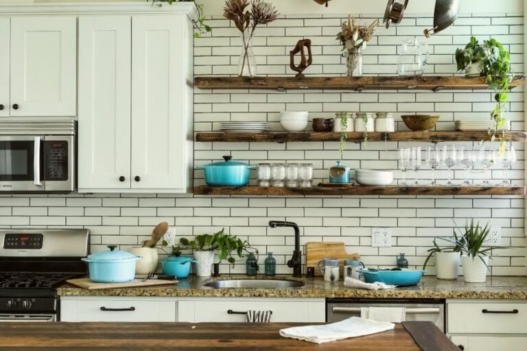
- White and Off-White: Still popular for a clean look. Can be warmed with wood accents.
- Soft Gray: Neutral and flexible. Works well with both cool and warm tones.
- Beige or Taupe: Adds warmth without going too dark.
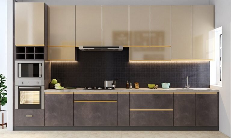
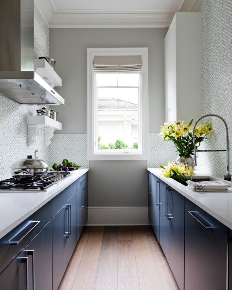
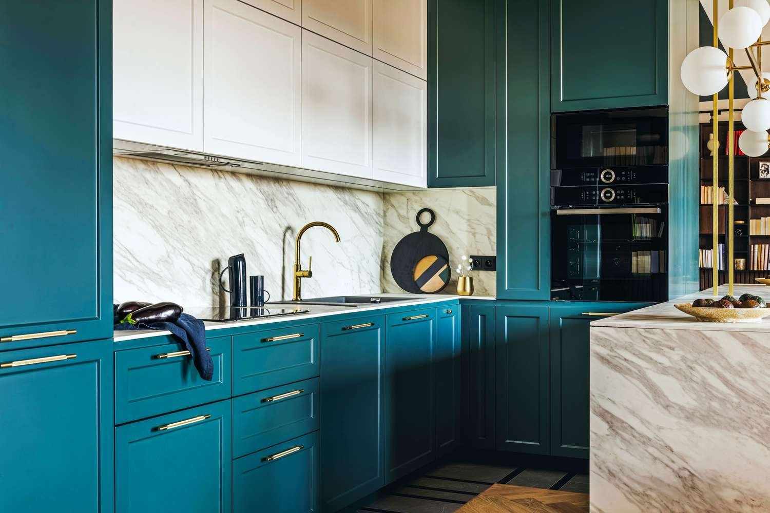
- Navy Blue: A rich color that pairs well with brass or gold hardware.
- Black: Bold but stylish. Often used for islands or lower cabinets.
Accent Colors
Accents bring life to a kitchen. They can show up in backsplashes, seating, or even appliances.
- Mustard Yellow: Adds energy without being too bright.
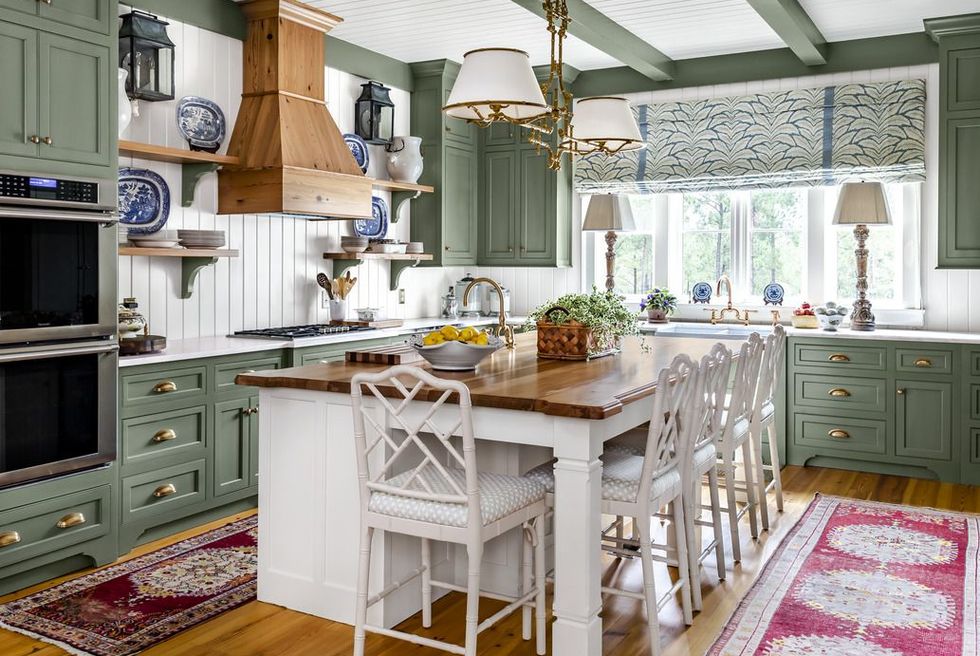
- Olive Green: Earthy and grounded. Works well with wood.
- Terracotta: Warm and rustic. Often tied to natural styles.
- Blush Pink: Soft and calming. A gentle alternative to beige.
- Deep Red: Brings warmth but should be used sparingly.
Mixing Neutrals with Color
A balanced kitchen often mixes neutrals with brighter shades. Too much of one can overwhelm the eye. Many designers now pair white cabinets with dark islands, or gray walls with warm wood shelves. This contrast helps the space feel layered.
Nature-Inspired Palettes
Nature continues to influence home design. People want kitchens that feel grounded and calming. This often means greens, browns, and muted blues.
- Forest Green and Cream: Earthy but fresh.
- Stone Gray and Wood Tones: Mimics natural stone and timber.
- Sky Blue with White: Light and airy.
- Clay Red with Sand Beige: Rustic and warm.
These palettes mirror what you see outdoors, which can make the kitchen feel peaceful.
Warm vs. Cool Palettes
Warm tones like yellow, red, and orange tend to make a kitchen feel lively. Cool tones like blue and green create calm. The choice may depend on how you use the space. If you host guests often, a warm palette may fit. For quiet mornings, cooler shades may suit better.
Contrast and Depth
Many homeowners now add contrast instead of sticking with one color. Black and white is a classic mix, but softer versions are common too. Dark lower cabinets with light upper ones create depth. A bold island color can serve as a focal point.
The tension here lies between safety and drama. Some designers warn against too much contrast, saying it can break up the flow. Others argue it keeps a kitchen from looking flat. The answer may depend on lighting and layout.
Small Kitchen Color Choices
Smaller kitchens need extra care. Light colors can open them up, while dark shades may shrink the space. Still, a dark feature wall or cabinet may add charm. The trick is balance.
Mirrors, glossy tiles, and glass also help reflect light. They can make darker colors work better in a compact room.
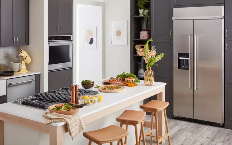
Large Kitchen Palettes
In bigger kitchens, there is room to play. You can mix three or more shades without it feeling crowded. Islands, walls, and cabinets can all take different tones.
For example:
- White cabinets with navy island and brass pulls
- Soft gray walls with wood shelves and cream counters
- Black lower cabinets, white uppers, and terracotta backsplash
The Role of Lighting
Colors look different under natural light versus artificial light. A paint swatch may seem cool in the store but warm at home. That’s why many designers suggest testing samples on site.
LED lighting also changes perception. Warm bulbs make shades softer, while cool bulbs may highlight blue undertones. Paying attention to lighting can keep the palette from looking wrong after installation.
Cultural and Personal Tastes
Not all kitchens follow the same rules. Some families like bold, bright tones tied to cultural traditions. Others lean toward minimalism. What feels inviting to one person may feel too plain or too busy to another.
In some cultures, red is tied to luck, while in others it signals caution. These associations can affect how a kitchen color is received.
Timeless Choices
While trends come and go, some palettes last. White with wood is a safe bet. Soft gray with marble stays stylish. Navy with brass has been around for decades.
Designers often debate whether it is better to play it safe or go bold. A safe choice may keep the kitchen looking fresh for years. A bold one may bring joy every day but risk going out of style.
How to Choose a Palette
Here are some steps that may help:
- Start with the cabinet color since it covers the most space.
- Pick a counter shade that matches but adds contrast.
- Add a backsplash that ties them together.
- Choose wall colors last since they are easiest to change.
It may help to create a mood board with samples. Seeing the shades side by side can show if they clash or blend well.
Common Mistakes
- Using too many bright shades at once.
- Ignoring how lighting changes the look.
- Forgetting about finishes like matte or gloss.
- Picking colors in isolation without testing them together.
Paint vs. Materials
Not all color comes from paint. Wood, stone, tile, and metal bring natural tones. A walnut counter adds warmth, while stainless steel adds coolness. Sometimes it’s better to let these materials guide the palette instead of adding more paint.
The Debate on Bold Kitchens
There is an ongoing discussion in design circles about bold kitchens. Some argue they show personality and energy. Others claim they may age poorly or clash with future buyers’ tastes.
The truth may sit between these views. A bold island or backsplash can be swapped later. Painting every cabinet a loud shade might be harder to undo.
Kitchen Color and Mood
Some studies link colors to appetite and mood. Red and orange may boost hunger, while blue tends to suppress it. This might not affect everyone, but it raises questions about how we react to our environment.
Parents may prefer calming colors to keep the kitchen less chaotic. Others may want lively tones to make the space feel social.
Looking Ahead
Future palettes may lean toward earthy, muted tones. With more people cooking at home, warmth and comfort seem to matter. Yet, bright pops of color are not going away. Many brands now show both ends of the spectrum in their yearly trends.
Conclusion
Choosing a kitchen palette is not simple. Trends, personal taste, cultural ties, and even science all play a role. A good mix should feel natural, fit the home, and make daily life smoother.
The best advice may be to pick shades you enjoy seeing every day. Trends will change, but a kitchen should feel like yours.