Two-Tone Kitchen Cabinet Trends
Kitchen design has shifted over the years, and cabinets play a large role in that change. One trend that continues to gain attention is the two-tone cabinet look. Instead of a single color running through every cabinet, this style combines two different tones, often one light and one dark. The result is a space that feels fresh, balanced, and interesting.
In this blog, we’ll talk about why people are choosing two-tone cabinets, how to mix and match colors, and what to think about before making the change. We’ll also look at different styles, from modern to farmhouse, so you can picture how this idea might fit into your own home.
Why Two-Tone Cabinets Are Popular
There are a few reasons this trend has stuck around. For one, it breaks up the monotony of a single-color kitchen. Too much white or too much dark wood can make a space feel flat. Mixing colors adds depth without being overwhelming.
Another reason is flexibility. You might not want to commit to an all-dark kitchen, but pairing dark lowers with lighter uppers feels less heavy. The balance between shades makes the space feel inviting.
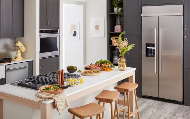
It also helps highlight certain areas. For example, a kitchen island painted in a contrasting color can stand out as a focal point.

Common Color Pairings
Not all color mixes work well. The key is to pair tones that balance each other. Here are some popular choices:
- White and Navy: Clean, crisp, and classic.
- Gray and Wood: Brings warmth without feeling too heavy.
- Black and White: Bold contrast with timeless appeal.
- Cream and Green: Soft but still interesting.
- Blue and Wood: Modern but grounded.
You don’t have to stick with these, but they’re a good starting point.
How to Choose Your Colors
Picking the right shades can be tricky. Here are a few tips:
- Think about natural light. If your kitchen is dark, lighter uppers can help bounce light around.
- Match with flooring. Wood floors might call for a cabinet shade that ties in rather than clashes.
- Consider countertops. If you have busy stone or patterned surfaces, keep cabinets more neutral.
- Test samples. Paint looks different under natural and artificial light. Always check before deciding.
Placement Matters
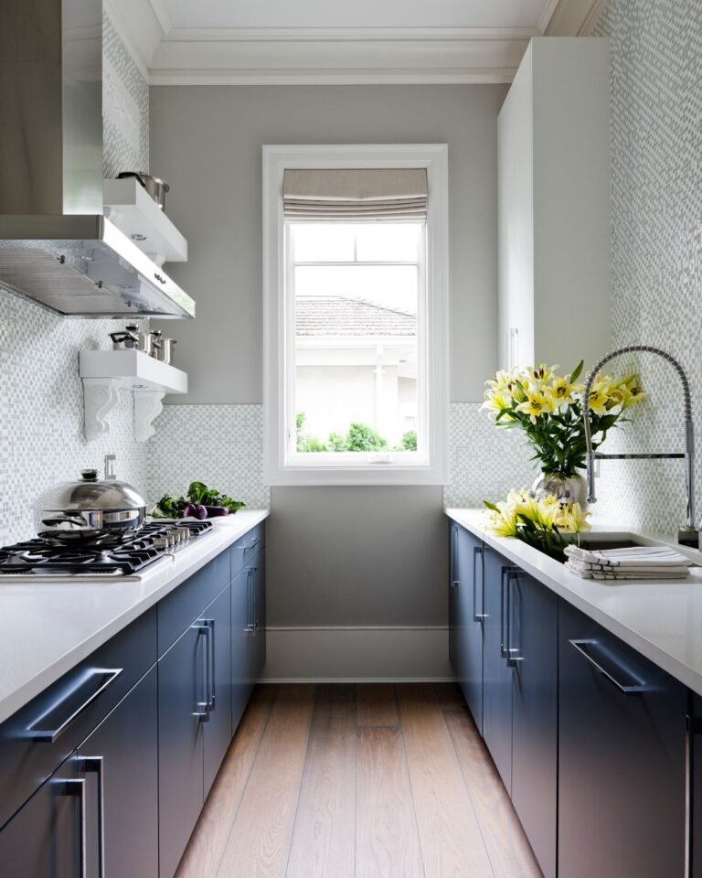
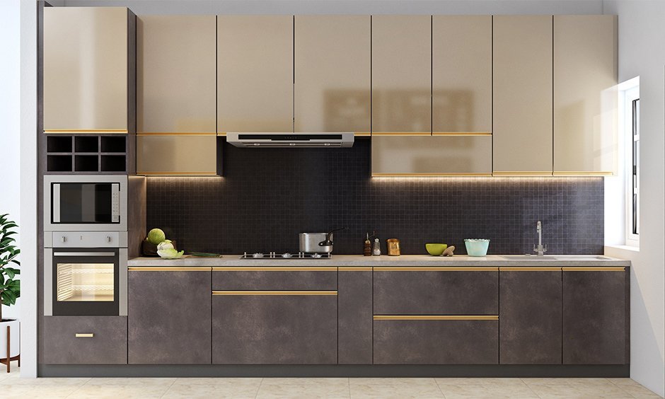
It’s not only about which colors you choose but also where they go. Most kitchens with two-tone cabinets stick to this rule: darker on the bottom, lighter on top. This helps the room feel grounded and open at the same time.
That said, some people flip the pattern for a more dramatic look. Others only use the second color on an island or pantry wall. There’s no single right way, but balance should guide the choice.
Style Variations
Two-tone cabinets aren’t locked to one design style. They can fit into almost any home. Let’s break down a few examples.
Modern Kitchens
Modern kitchens often pair sleek cabinets with sharp contrasts. Think black lowers with white uppers, or gray with a wood island. Clean lines and minimal hardware finish the look.
Farmhouse Kitchens
Farmhouse style leans toward softer mixes. White or cream uppers with navy or sage lowers are common. Natural wood also plays a big role here, especially in islands and shelving.
Transitional Kitchens
This style blends modern and traditional features. A common choice is neutral lowers with warm wood uppers. It feels balanced and timeless.
Bold and Playful Kitchens
For those who like color, two-tone is a chance to have fun. Bright lowers like teal or mustard can be paired with simple white uppers. The effect is cheerful but not overwhelming.

Practical Considerations
Before jumping in, there are some things to think about.
Cleaning
Lighter uppers may show grease less than darker ones, which makes them easier to maintain. Dark lowers may show dust or pet hair, but they also hide scuffs better.
Budget
Painting or replacing cabinets in two colors can cost a bit more. Sometimes you can save by painting existing cabinets instead of buying new ones.
Long-Term Appeal
Trends shift. While two-tone is popular now, think about whether you’ll still like it years from now. Neutral mixes may age better than bold choices.
The Psychology of Color
Color affects how a room feels. Warm tones like beige or cream create a cozy feel, while cooler tones like gray and blue make a room seem calmer. Dark shades can feel dramatic, while light shades open up space. Two-tone cabinets let you mix these moods in one kitchen.
Tables of Pairings
Here’s a quick chart of color ideas:
| Upper Cabinets | Lower Cabinets | Effect |
|---|---|---|
| White | Navy | Crisp, timeless |
| Gray | Walnut Wood | Warm, modern |
| Cream | Sage Green | Soft, farmhouse |
| White | Black | Bold, modern |
| Blue | Natural Oak | Fresh, balanced |
Mistakes to Avoid
Some common errors can make two-tone cabinets look less appealing.
- Too many colors: Stick to two main shades. Adding more can feel messy.
- Ignoring the room size: Small kitchens need lighter tones to feel open.
- Forgetting about hardware: Knobs and pulls can clash if not chosen carefully.
- Skipping samples: Always test colors under your own lighting.
- Not thinking about the rest of the house: Your kitchen should still connect with nearby rooms.
DIY vs Hiring a Pro
Some people paint their cabinets themselves. This can save money, but it’s not easy. Cabinets take a lot of prep, sanding, and priming. A pro might cost more, but the finish will likely last longer.
If you want to try it yourself, start small. Maybe just paint the island and see how it looks. That way, you can test the idea without committing the whole kitchen.
Trends to Watch
While the basic two-tone idea isn’t new, fresh twists keep it interesting.
- Textured finishes: Instead of just paint, some people mix wood grain with smooth lacquer.
- Unexpected colors: Deep green, plum, or even muted yellow are showing up more.
- Matte over glossy: Matte finishes are replacing shiny ones for a softer look.
- Metal accents: Brass or black handles add contrast without changing colors.
Final Thoughts
Two-tone cabinets are not just a passing trend. They let you play with contrast, add character, and make your kitchen feel like it belongs to you. The right mix can brighten a small space or make a big one feel warmer.
When done with thought, this style balances beauty with function. Whether you go bold or stay neutral, it’s about finding the mix that feels right for your home.